
REBUILDING AN EMPLOYEE SYSTEM: FOUNDATION MEDICINE INTRANET
While working as a lead service and experience designer for Foundation Medicine, I was given free rein to overhaul the platform from the ground up including redesigning the entire site’s architecture, branding and user interface. Over the course of my 2 years at BTR, I led several projects and initiatives to increase the efficiency of the site for both listeners and hosts.
Client:
Foundation Medicine
Foundation Medicine (FMI) is a cancer pharmaceutical research company whose mission is to create cancer therapies and patient care programs alleviate the journey of the cancer diagnosis.
With 3,000 employees spread across 8 labs and offices in the US and Germany, their intranet is key to keeping everyone abreast of information and connected, especially during a pandemic that upset their normal working styles.
Problem:
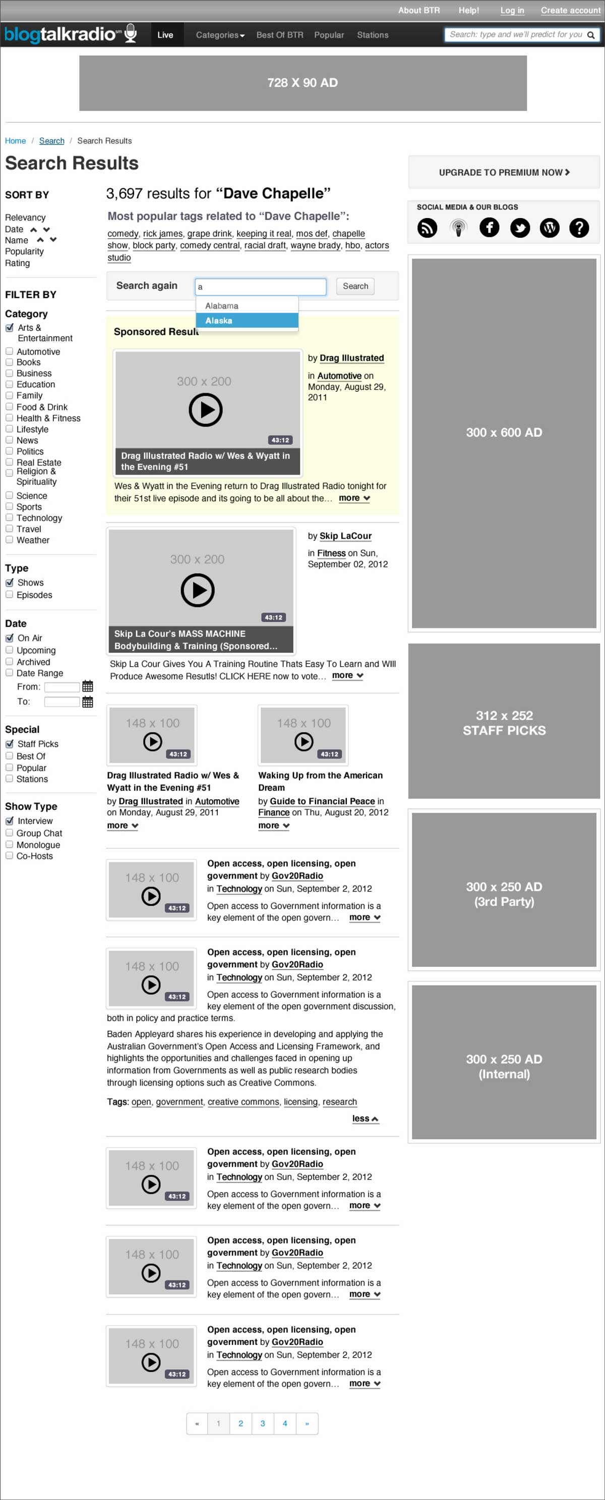
BlogTalkRadio’s website at the time (2012) was 6 years old, incredibly outdated, and wasn’t usable on mobile or tablet for either the hosts or the listeners.
In order to sustain the life of their business model of UGC content, they needed to:
Modernize its grid and style guide design
Increase paid host subscriptions
Overhaul the information architecture to make it easier for listeners to find content
Role:
LeAD SERVICE AND EXPERIENCE DESIGNER
REMOTE COORDINATING W/TEAMS IN BOSTON, MA & austin, tx usa
Techniques employed: user interviews; journey mapping & service mapping; user scenarios; site mapping; content auditing and information architecture redesign; wireframing; user testing; 2-week agile design & engineering sprints.
Solution:
From the analytics and surveys, I discovered that 45% of our users had a tablet at home. This moved the redesign in the direction of eventually converting the site over to a responsive framework to accommodate both hosts creating shows and listeners consuming content.
Gathering various sets of data by reviewing Google Analytics, prior surveys and conducting my own current surveys to understand the demographics led me to experiment with multiple rough prototyping methods. Each guerrilla prototype led to a finalized design implemented with both my director of product design and the engineering team.
Results
On the home page, there was a 95% increase in organic visits & 37% increase in organic page views.
Free Host subscriptions increased 35% after the redesign while Paid Host subscriptions increased 16%.
Mobile & tablet page views increased over 60% in the 3 months following release.
PROJECT CHALLENGES
Convincing the engineering team to revise the information architecture of the site instead of layering more band-aid fixes onto the existing code and interface.
Convincing the C-level stakeholders that it was worth the time to redesign the site structure and to spend time user testing.
Collating over 135 subject categories down to a usable number for site visitors and hosts.
AUDIENCES & SERVICE JOURNEYS
Paid Subscription Hosts
Description of persona.
FREE Subscription Hosts
SHOW LISTENERS

(Click to enlarge)
IDEATION, DESIGN & EXECUTION / KEY POINTS IN MY TENURE:
Paper Prototyping Workshop w/Various Teams
After initial information gathering via surveys and interviews, I led a paper prototyping workshop with different internal departments at BTR: product design, marketing and engineering to address giving the site a new grid and determining the most necessary content and features to take into the next generation of the listener-facing site.
From the start I wanted it to be a holistic design process including other team members from engineering, marketing, and acquisition. Each team member was able to voice his or her concerns and give input into the revised layout that benefited their own core duties within the company.
The main goal was to prototype different layouts, search architecture and ad placement.

Click to enlarge

Interactive workshop where I demonstrated the process of paper prototyping to team members, allowing them to move different parts of the layout around.
Lightbulbs went off in their head and the session sparked excitement or ideas to help them accomplish their goals.
Interviewed the remote customer service team to hear their must-haves for the redesign and integrated it into feedback.
After the prototyping working, I did video calls to walk them through proposed changes to help me understand how they would affect the CS team’s workload.
Responsive Grid / Twitter Bootstrap Prototyping:
The next stage after the paper prototyping workshop was to create a digital version of the new grid by me coding one using Twitter Bootstrap. The purpose was to counter the resistance by the engineering and C-level teams to overhaul the UI architecture and the back end architecture as well.
I stressed that switching to the Twitter Bootstrap framework could easily be implementable by the engineering team and modular enough to withstand changes in design or team members. This also demonstrated how we could accommodate tablet and mobile users of all audiences.


INFORMATION ARCHITECTURE REVAMP & USER TESTING
user Testing the existing search architecture
After seeing the user test videos of users taking 13 minutes to find a topic in the menu instead of the 30 seconds we were aiming for, the engineering team were completely convinced to prioritize the information architecture restructuring.
To force home the need to redesign the information architecture, I designed a video-based user testing campaign that asked users to complete 3 tasks. The primary tasks were to find certain topics in the menu or sign up for an account, etc. Before this test, the engineering team did not consider the extensive super menu to be a priority for reconfiguring.
Key Changes:
Reduced content categories from 135 down to 20 main categories and combined subcategories to make the filtering system less overwhelming.
I took this opportunity to work directly with the engineering team to test new search systems on the site. We tried both ElasticSearch and Google Search and implemented the latter.
Created a tag structure for hosts to use to identify their content themselves. This resulted in hosts feeling they could surface their content for both loyal and potential listeners.

Drastically reduced Category menu, from 130+ to 20 categories.

Categorizing types of pages, templates and content on respective pages.

Wireframing interior and landing pages.
BRANDING, PRODUCT & SITE REDESIGN
We moved onto the visual design of the site but still kept our iterative process of testing paper wireframes of grid design ideas. Our main plan was to improv & redesign the interface of core sections of the site: Home Page; category pages; search page; we also focused on the individual show pages to maximize listening.
The end result was a responsive design that was easily usable on mobile and tablet; Modernized typography, colours, buttons, designed responsive icons, etc.; and created a style guide / pattern library for engineering team to follow.